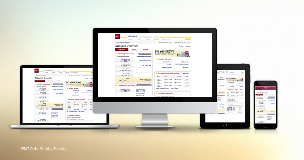
Re-design existing online banking pages. Make them look and feel more modern and user friendly. Implement new financial services such as: linked accounts, credit score, bill pay, transfers, and financial tools. Make those pages responsive and suitable for mobile devices.
Create new feel and look for Online Banking Pages. I was responsible for providing mock-ups of several versions of design for approval.
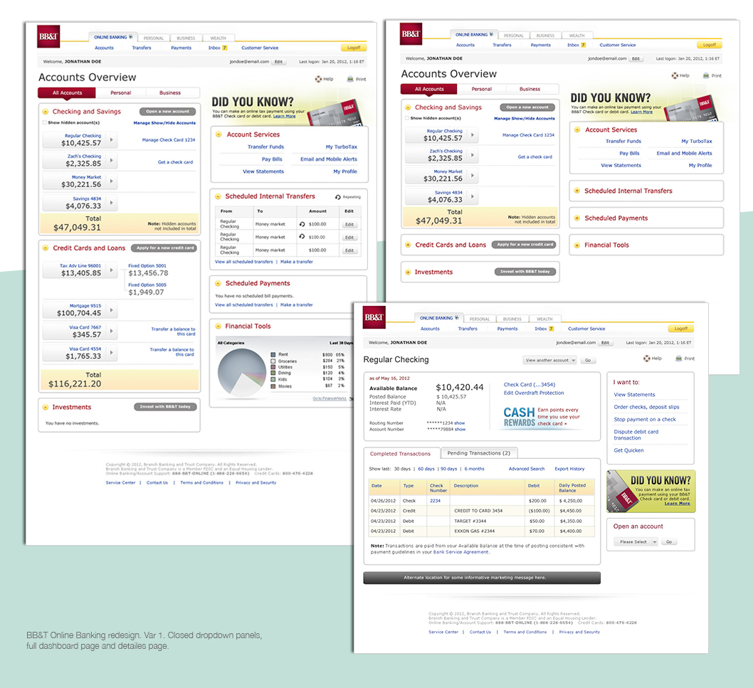
A large amount of information can make any page look busy and overwhelming for the user. It can make it easy to overlook important information and get frustrated. The layout had to possess all available financial tools and services while at the same time be light and balanced enough so as to make it easy for user navigation. For example, I suggested collapsible panels and it worked very well. All team members liked the idea and the decision was made to proceed with my suggested idea.
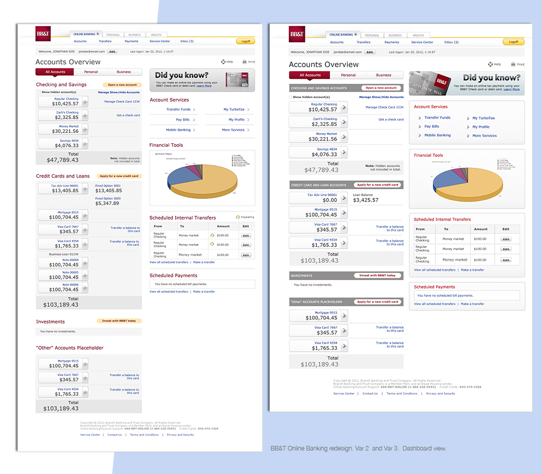
The most important information on the page are the numbers, so I made other colors more neutral and calmer to not distract users from what is important to them. There are a few places for promotional banners and I suggested to make them stand out, using brighter colors. Besides those, the page overall has to have a neutral and light look to it.
Adobe Illustrator
Adobe Photoshop
Adobe Dreamweaver
This project was put on hold and later was re-branded as U by BB&T. U by BB&T was a new mobile and online banking interface with enhanced features to help users manage their financial life. A lot of ideas and resources for this project were used for designing U.